www.Headless Moron.com
                    A Seriously Froody Website


History


Long-time readers will know that my website has gone through a number of versions (some good, some not) over the years. This is a tribute to those various designs.


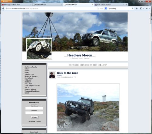
11: JawaPro.com Floating Crisp Layout

My old design was fast to load and pretty solid from a technical perspective, but was starting to look a bit dated in 2013. Especially on the widescreens which were invading computer desks everywhere. So I figured it was time for another change.
This version is based on Facebook’s timeline design - but without all the extra clutter. Why Facebook? Well - I liked some elements of the design - and I ditched the others. I thought the images of Oscar my mighty Pajero looked pretty sweet. Simply a cosmetic change this time.
 
 Image


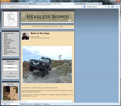
10: JawaPro.com Sand Layout

It was time to head back in time! This iteration returned to the previous style, but now aligned to the left, and with some different colours and some serious improvements in the way images were handled etc. Survived until 2013 when the invasion of wide-screens started to make it look a little lame (with all that empty space to the side).
 
 Image


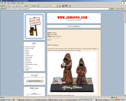
9: JawaPro.com Reloaded

Ever have a great idea that turns out not to be so great?
This redesign was in response to comments that my website looked odd sitting in the middle of the screen. So I shoved everything to the left, and built a clumsy menu frame (which I thought looked good at the time).
On a positive note - CSS positioning took the place of the old-school table layout, but that’s all behind the scenes. My blog continued to be fairly popular though (among friends) - even though the design was a step backwards.
 
 Image


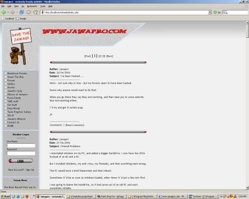
8: JawaPro.com

This time I had a domain name and proper hosting! I also had a much better website.
Based on a uni assignment - this version boasted a hand-written blog engine that I’m still using today (2013).
This design lasted for well over a year before my next redesign (which was a mistake in hindsight).
 
 Image


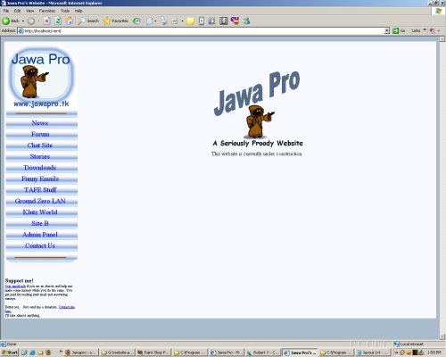
7: JawaPro.TK

The first of the PHP sites, this version was on the net for quite a long time. Accessible by the address www.jawapro.tk, this site remained until my hosting company decided to stop offering free hosting, and the site disappeared - forcing me to find a new host.
 
 Image


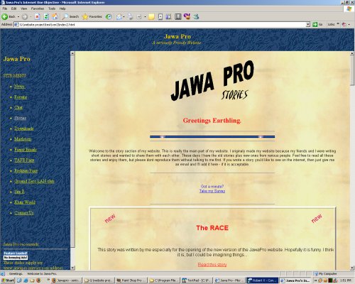
6: JawaPro Mark V - Last of the Frames

This time it’s TAFE blue! This was the last website I made that used iframes. After this I learnt about PHP and my websites all changed for the better.
 
 Image


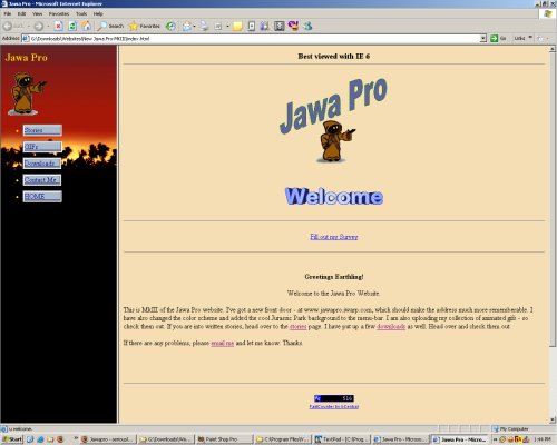
5: JawaPro Mark IV

The same basic site as Mark III, but now with a shiny Jurassic Park skin! Not sure if this version ever made it online.
 
 Image


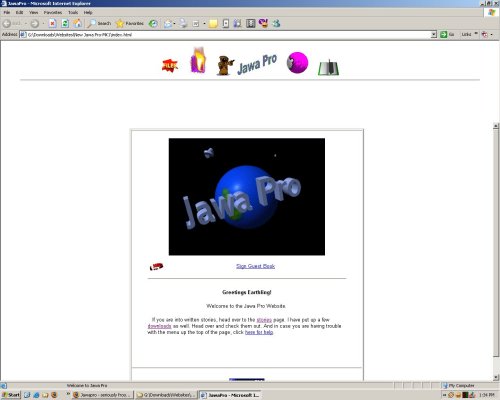
4: JawaPro Mark III - cloud.prohosting.com/jawapro

This version lasted for quite a while. It basically took the Version One site, added a frame with a menu on the side, a few more pages, and a slightly rememberable address. It was the first time my website was more than just a story-portal.
It also featured the spinning world logo that I created myself and used to be very proud of, as well as the spinning "Welcome" image. Lots of spinning stuff here...
 
 Image


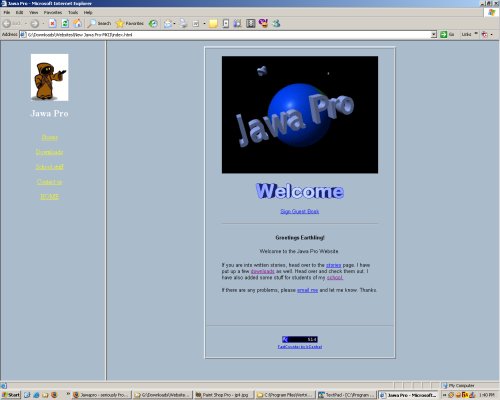
3: JawaPro Mark II

I decided to redesign my website, and figured it made sense to base it on an existing design that I respected - in this case the ancient Yahoo homepage (it wasn’t ancient at the time).
This design was scrapped before it was inflicted on the internet.
 
 Image


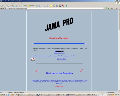
2: JawaPro Version One

Jawapro arrived on the net! This version was little more than a place to store and share stories that my friends and I had written (they are still available on the current version - 2013).
This version was also the first time I used the colour #aabbcc (that’s hex) as a background - something that stuck around for years to come. Lots of flashing and spinning images - and a nifty little ticker message in the taskbar.
 
 Image


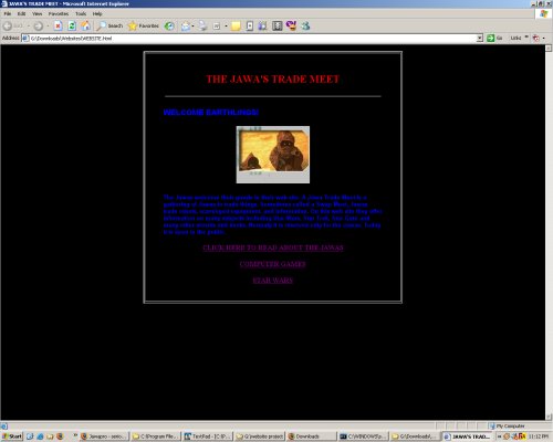
1: The Distant Past

The net was young, and so was I.
I’d just learnt HTML.
Geocities ruled the web, black and blue were cool, and I had grand dreams of creating the ultimate website. It was going to be a website where you could read about anything you wanted (at least that I was interested in). Basically it was Wikipedia before Wikipedia existed. Well, it would have been if I’d written more than about 3 pages.
This version never quite made it online before I gave up on it. Good thing too - that colour scheme gives me headaches now….
 
 Image